Multi Theme Vue SFCs
multi theme vue sfcs

Wouldn't it be nice to be able to develop a vue component library that supported multiple different themes while still taking advantage of vues single file component system. Maybe you have different front end applications that consume the library and you want a different look for each. It can be helpful to have the same component library api between the apps but still be able to customize the look. A quick thinking solution for this might be having a seperate css file for each theme but then you dont get the power of scoped styles and bundle splitting that you do with sfc. Also with sfc you can keep your code organized. I dread the idea of returning to monolithic css files of my past now that I've used vue sfc style blocks.
Thankfully we can continue to use vue sfc for multiple themes with a super simple vite plugin.
import { defineConfig } from 'vite';
import vue from '@vitejs/plugin-vue';

const vueStyleTheme = (pickTheme: string) => ({
  name: 'vue-style-theme',
  transform(_code: string, id: string) {
    //remove style blocks where theme doesn't match
    if (
      /vue(?:[^&]*&)?type=style/.test(id) &&
      id.includes(`theme=`) &&
      !id.includes(`theme=${pickTheme}`)
    ) {
      return ' ';
    }

    return;
  },
});

export default defineConfig({
  plugins: [vue(), vueStyleTheme('bootstrap')],
});
As you can see we've customized our vite config with a new simple plugin. The plugin intercepts the vue sfcs and purges the styles for themes that don't match. At the end we are left with a library with only the styles for the theme we want. You can setup a second or third vite config to handle the other themes in your component library.
Heres how you can use this in your vue sfcs
<script setup lang="ts">
import { ref } from 'vue';
import { Tabs } from '@ark-ui/vue';
import CbTabs from '../components/Tabs/Tabs.vue';

const value = ref('vue');
defineProps<{
  right?: boolean;
}>();
</script>

<template>
  <Tabs.List class="tab-list" data-part="tabslist" :data-right="right">
    <slot />
  </Tabs.List>
</template>

<style>
.tab-list[data-part='tabslist'] {
  display: flex;
  align-content: center;
}
.tab-list[data-part='tabslist'][data-right='true'] {
  justify-content: flex-end;
}
</style>

<style theme="bootstrap">
.tab-list[data-part='tabslist'] {
  border-bottom: 1px solid #ccc;
  padding: 0px 10px;
}
</style>

<style theme="material">
.tab-list[data-part='tabslist'] {
  color: white
  background: blue;
}
</style>
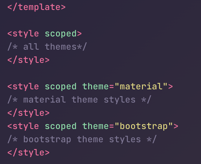
Here we have a tab component with styles for both a material theme and a bootstrap theme. Notice the theme setting in the style tags. Also note that style tag blocks without the theme can be used for setting properties for all themes!